


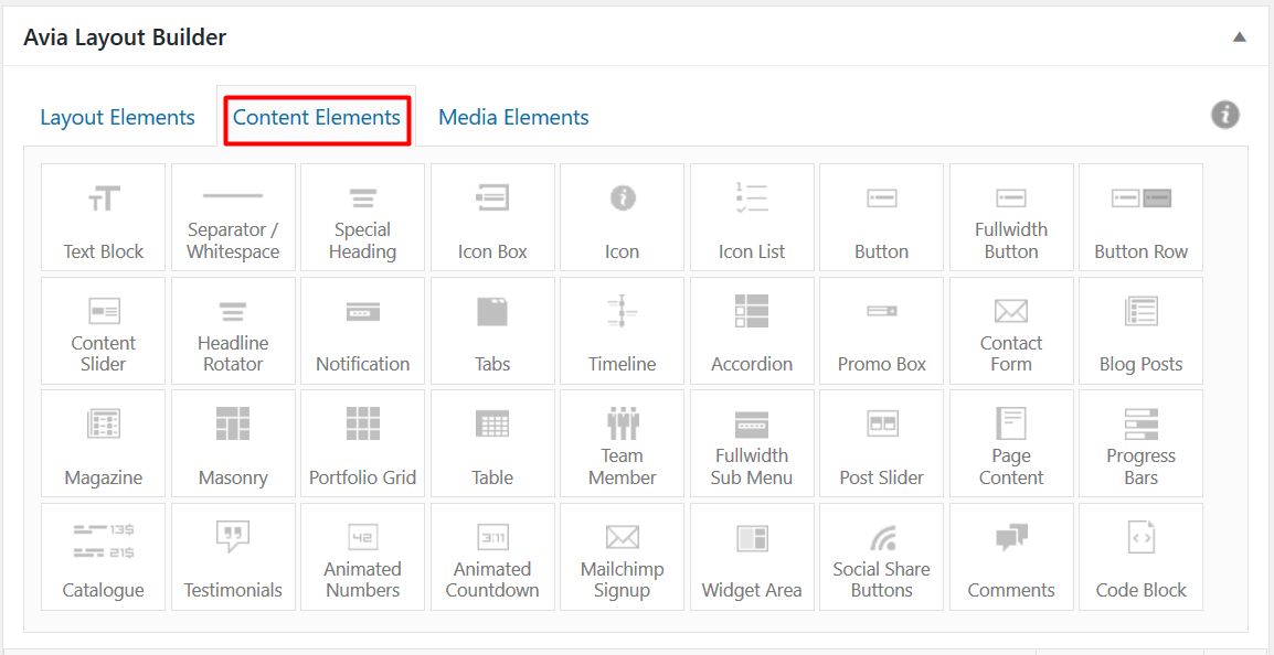
Content Elements

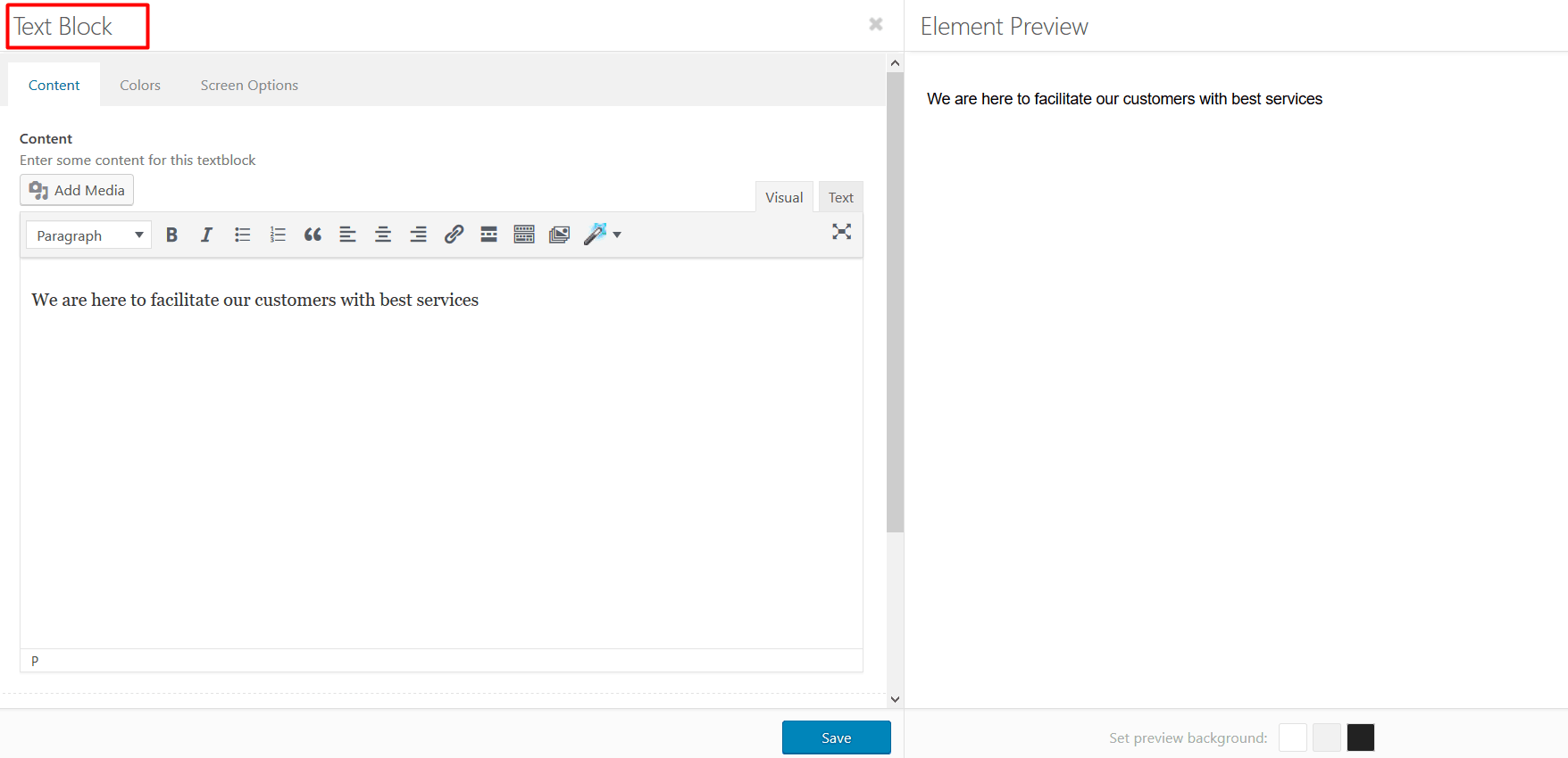
1. Text Block
This element will allow you to add content within your web page. When you drag this within any layout element and click on it, a “Text Block” window will be opened. You can edit content, set heading (from H1 to H6), make content bold or italic, add an image, and much more. You can format whole content to make it easy to read and understand. Not only this, but you can also interlink your other inner pages on the same window.

2. Accordion
If you have multiple content sections and you want to display all of the content in the most concise manner, you can use this element. This will help you feature all of the content without making users to scroll too much. The Accordion element can help you keep different sections of content in one place.
3. Animated Countdown
The animated countdown is an interactive way to let users know about new upcoming promotions, product launch, or any event in the future. This element doesn’t work for past events. It is designed to be catchy and it counts each second, minute, and hour. You can also set the number limit, so once the set time is reached the counter will stop.
The animated countdown element comes with a variety of predefined styles that includes default style, the transparent light or dark styles that work well when used above solid colors or images.
4. Separator/Whitespace
The Separator/Whitespace element will allow you to separate content using a simple line. This separator element comes with a variety of separators, which include predefined separators and custom ones that you can design as per your choice. The custom separator will allow you to choose its styling, position, border, width, color, icon and others.
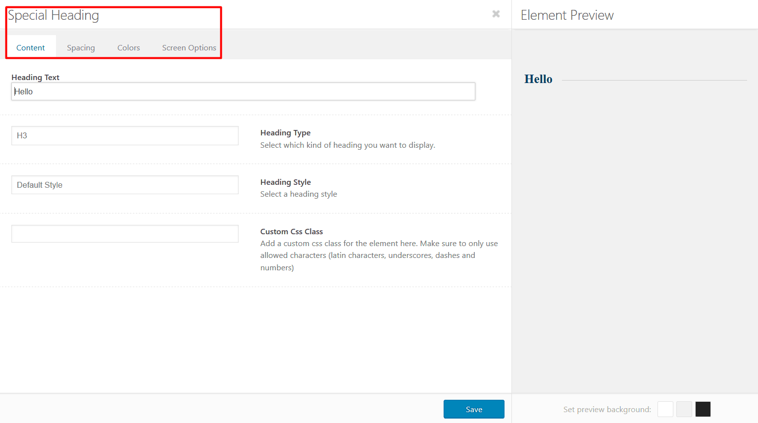
5. Special Heading
This element allows you to create custom headings with various types, styles, sizes, and colors. You can also create a subheading. A subheading can be displayed above or below the main heading and you can also set its size. You can also manage the spacing and color of your heading by going to the respective tabs.

6. Icon
An Icon element allows users to display a single icon anywhere on the page. You just need to drag and drop the icon element and edit it as per your choice. You can customize icon’s style, size, position, and color. You can also link any of your pages to this icon.
7. Icon List
Icon List is quite similar to the Icon Box element and it can consist of any number of Icons. Users can easily add the icons of social media and others bundled with the theme. The icon list displays a subtle animation once the users reload the web page or scroll to the icons list.
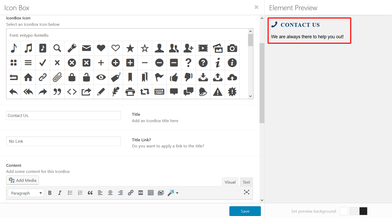
10. Icon Box
Use of the Icon Box element will allow you to add a block with a headline, icon, and some content on your web page. It can be easily styled in multiple ways. From managing icon’s background color, font color, and border color to choosing the right color for the title and content, you can customize everything from the Colors tab on the Icon Box window.

12. Content Slider
Ever wanted to slide text on your web page? The content slider allows you to do so. The element keeps the web page interactive. To make it more appealing, you can simply add this element inside a color section where you can add a background image, color, or video to the color section.
13. Headline Rotator
The Headline Rotator element allows users to showcase a headline with a constantly changing message or words. Using this element, you can animate a group of words to draw users' attention towards specific message. You can also modify the visual appearance of this element by making changes in its alignment, size, and color.
14. Notification
Whenever you want to display a temporary or permanent notification regarding a seasonal discount, current situation, or a temporary glitch on your website, the Notification element is there to meet your needs. The element is used to display a notification box with a message in a variety of styles depending on the importance of the message.
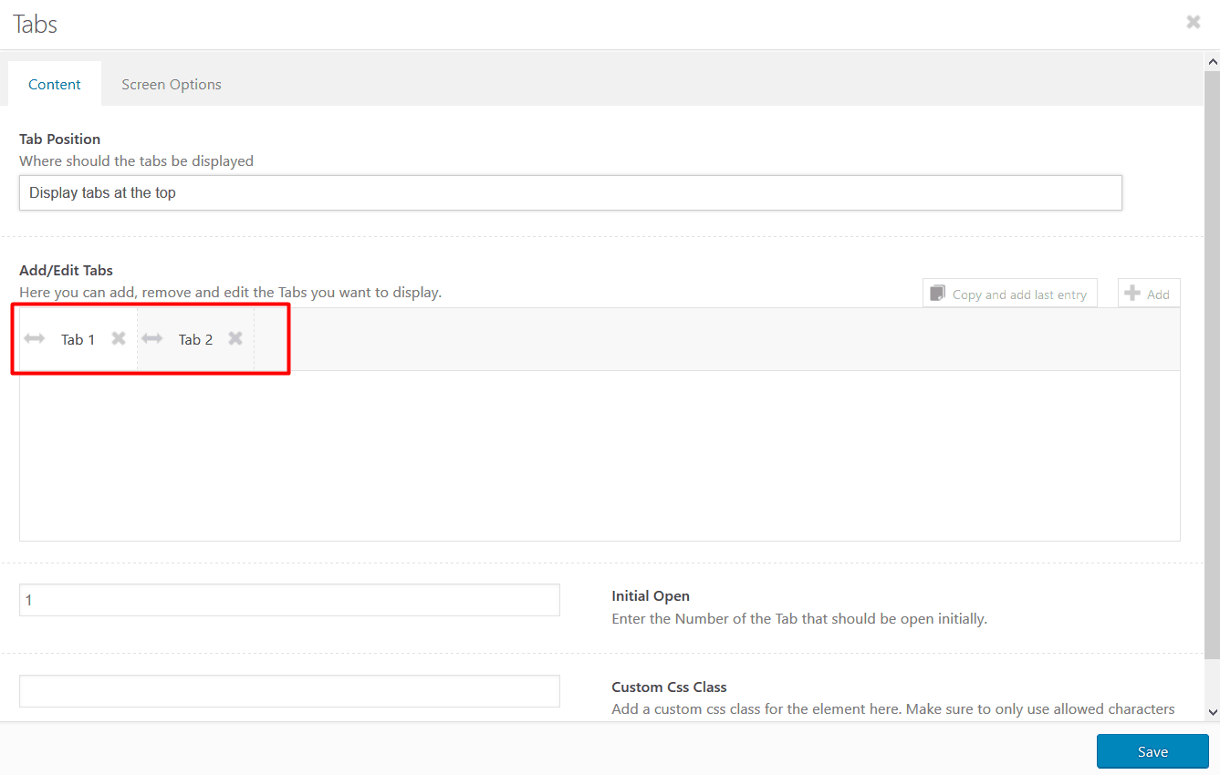
15. Tabs
The tabs element allows you to display smaller content tabs. It can be placed within the columns, color section, or can be used as a fullwidth element. This element offers a variety of options for styling and positioning the tabs on your web page. You can also add display icons with the tab title and enter the number of the Tab that should be open initially.

16. Promo Box
The Promo Box Element allows you to add a special notification with a call to action button. You can customize the button, whole notification bar, its text, and much more. This element can be added to any column, color sections, or it can be used as an individual element.
17. Table
The table element can be used to display any form of tabular data in much organized manner. You can also use this element to create tables with custom styling, it is mostly use to showcase pricing options. You can add or delete columns and rows from the table any time. The table element can be a part of any column, color section, or you can use it as a fullwidth element.
19. Page Content
The page content element will allow you to display the content of any of your web pages to another page. Just drag & drop the element, click on it, and select the page you want to feature. The element is easiest to use.
20. Testimonials
With the Testimonial element, you can display your customers’ reviews without any hassle. Choose the testimonial style as per your wish, you can use it in a slider form or in a grid form. You can also choose the number of grid columns to showcase on your page, it can be anything from minimum: 1 to maximum: 4 testimonials.
21. Animated Numbers
With the Animated Numbers element, you can set up a simple numbering counter. Use this element to display quick and interesting statistics/numbers about your company or project. With a fun animated count of the numbers, you can grab users' attention instantly.
23. Code Block
As the name says, this code block element can be used to embed custom code or execute the code (HTML,CSS ,JS, Shortcodes, etc.) on specific pages/sections of your website.
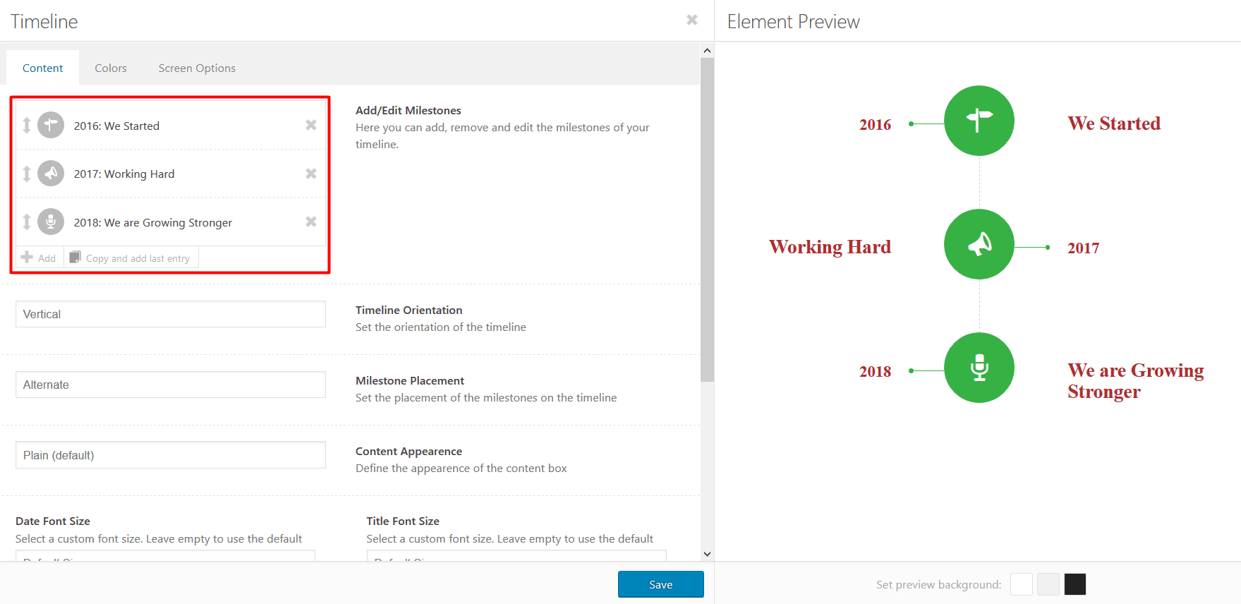
24. Timeline
Timeline element will allow you to display dates along with the milestones you have achieved. You can also use this element to define steps along with the numbers, dates, or others. You can easily customize this element by setting its orientation (set it horizontally or vertically), milestone placement, content appearence and etc. From changing text to everything, you can do it all.

25. Progress Bars
This element allows you to add any number of progress bars in various colors. You can customize it by adding an icon and description. The progress bars will help you design a user interactive section, which is a plus.
22. Social Share Buttons
This element will allow you to display a list of social share buttons. The element is mostly used on portfolio or blog entries to make it easy for people to share the content. The element is available in 2 different styles and a great number of buttons to choose from.